I’m currently in the process of filing a lawsuit against Honda and Toyota, but it also looks like I might have to add a few other manufacturers onto my list. I don’t necessarily want to exert my legal rights, but I feel that these corporations have gone too far and someone needs to put a stop to their shameful theft of other people’s creativity. You see, they’ve unabashedly stolen my intellectual property—the fruits of my labor—and not only did I not receive any type of compensation, I didn’t even receive so much as an acknowledgement for creating what has obviously become a bold new design trend.
The genesis of this story dates back to Mrs. Sian’s second grade classroom. In a moment of pure, divine inspiration, I grabbed—here’s the pure genius part—a ruler(!) and laid down the design for a truly advanced vehicle that, rather than having flowing graceful lines, completely broke with the conventional design philosophy of the previous 75 years of automotive styling. No, my car was, in essence, a giant square box—brilliant!—composed solely of straight lines and right angles, as only an iconoclastic seven-year old could create. However, little did I know at the time that evil forces were at work.
Mrs. Sian soon confirmed the brilliance of my design by telling me that she wanted to hang my work on the bulletin board, right next to Susie Grossman’s captivating portrait of Abraham Lincoln fashioned solely from uncooked macaroni. Who would have thought this seemingly kind old woman in sensible shoes would later become the automotive equivalent of Mata Hari? Sure, she put my “Super-Mega-Box-Mobile” on the board for all to admire, but when the end of the year came, she quickly disappeared and, with her, the crowning achievement of a young automotive mind. Sadly, my attention was soon distracted from this injustice by the introduction of a new GI Joe with Kung Fu grip (finally, technology for the masses!) and so I quickly forgot about the “Super-Mega-Box-Mobile.” That is, until last year.

Editor
Imagine my surprise and shock when I went to the Los Angeles Auto Show, and there on the Toyota stand was a vehicle that their marketing staff had ingeniously renamed the “Scion.” After a moment of stunned silence, I began screaming at the tops of my lungs, “That’s my Super-Mega-Box-Mobile! That’s my Super-Mega-Box-Mobile!” Eventually security escorted me out of the building, but not before I dropped to the floor and threw a right proper hissy fit.
At first I couldn’t fathom it. How could they have so completely copied my design from 30 years ago? Then it hit me like a lightening bolt—Mrs. Sian! Hmm, wait a minute…Sian…Scion! That shameless shrew obviously held on to my clearly advanced design and, when the design climate was sufficiently depleted, sold it to Toyota for untold riches.
However, the story gets worse. Other manufacturers must have seen the brilliance in this adolescent design because soon Honda came out with its own version called the Element. Before I knew it, it seemed that every manufacturer had its own version of my “Super-Mega-Box-Mobile.” Oh, they can try and hide it with a subtle tweak here or there, but there is just no hiding those minimalist straight lines and 90-degree angles.
I guess the part that so stuns me about this whole ugly episode is that you would think that these major auto manufacturers could come up with something more original—more sophisticated—than the “box on wheels” design of a hyperactive seven year old! I mean, there’s got to be more depth of talent in the industry than that, right? Of course, truly bad design is not the sole purview of the road car manufacturers—the racing world has had its share of ugly ducklings over the years as well.
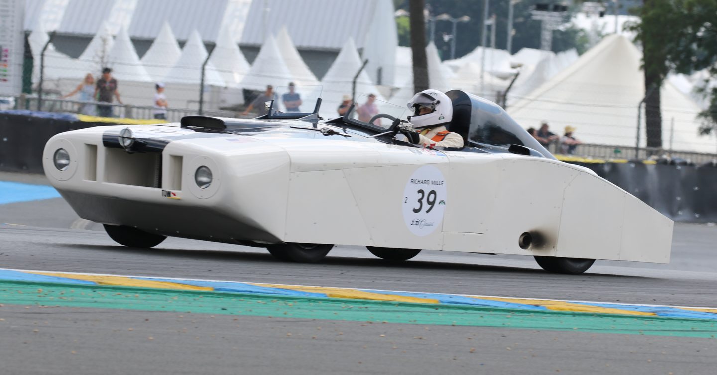
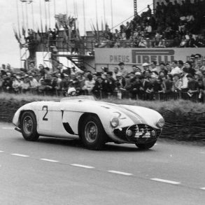
Briggs Cunningham’s “Le Monstre” certainly wouldn’t have won any “Best of Show” awards, but at least its design had an underlying—though somewhat misguided—aerodynamic purpose. Other notables on the all-time ugly racecar list include the ungainly looking March 711 (remember its flying saucer front wing?), the B series Connaught, as well as the original Old Yeller Mk I, which some consider to be almost ugly “by design.” Any other candidates?
In the defense of racing, however, I will say that in nearly all these cases the car’s form was usually a specific offshoot of its function—essentially it was ugly for a reason. Sadly, this cannot be said for this new generation of uninspired, boxy and/or down-right ugly designs that seem to be weird just for weirdness’ sake. No—it’s time that the manufacturers that have perpetrated these atrocities on us on us are held accountable for their actions—and while I’m at it, I think I’ll hunt down Mrs. Sian as well.


